Saturday, November 22, 2008

FOR THE THANKSGIVING TABLE

The rustic farmhouse look has taken hold this holiday season and is making an appearance in everything from white birch patterned desert plates to rough hewn pewter accessories. Get out your old pine chairs and hand-knit throws!
Photo Courtesy of Williams Sonoma Home
Great for the rustic Thanksgiving table, these White Pumpkin Tureens are on sale now at Williams Sonoma Home.

Photo Courtesy of JK Adams
Slice bread with a smile, get a festive wood cutting board from Vermont through The Kitchen Store Online at JK Adams. They also make a mitten and a tree that would be great Christmas gifts...

Photo Courtesy of Reed and Barton
I have always loved these serving pieces from The Thomas O'Brien Collection for Reed and Barton. They are well- priced, classic over- sized serving pieces every home should have. Order the Tiago 2-piece buffet set from Reed and Barton and use it all year round.

Photo Courtesy of West Elm
This Artisinal Glassware from West Elm is affordable and you will use it over and over. Run out and get it for your turkey-laden table at West Elm.

Wednesday, November 19, 2008

A SIGN OF THE TIMES: O AT HOME AND COTTAGE LIVING SHUTTERED

With the housing industry in turmoil and the economy in flux, shelter magazines are feeling the pinch. There will be fewer inspirational sources out there for magazine hounds. With Cottage Living being closed today and O at Home folding two weeks ago, I think the new design books and blogs are where many of us will now turn for ideas, color palettes and resources.

Tuesday, November 18, 2008

THE GREYSTONE MANSION VERANDA SHOWHOUSE IN LA

Veranda Magazine recently held The Greystone Mansion Showhouse in Beverly Hills, CA. The showhouse took place in a Guilded Age California manse from November 1-16th. The house had good bones, so there was plenty to work with. What made this showhouse unique was the design premise. Veranda posed the question to the designers, "What would this home look like if a young couple lived there when the home was built?" Below are results from some of the participating designers:

Photo by Samuel Frost
Joe Lucas and Parrish Chicoat of Lucas Studio did this outdoor seating area with pops of green and brought many interior pieces out. A painting on an easel and a cabinet all weathered the elements. A lamp outside? It's California!

Photo by Samuel Frost
In addition, Lucas Studio also created this young interior with pops of color. The walls are upholstered in a fabric from the new Ferrick Mason fabric collection. Brian Ferrick, a fabric genius, and Alex Mason, an artist, joined forces to create this terrific new line based on Alex's paintings. You can find it at Peter Dunham's Hollywood at Home in LA.

Photo by Samuel Frost
Lucas Studio mixes great silhouette's with textured pieces. The overall effect is a great mix. Check out their shop Harbinger, which I have mentioned on earlier posts.

Photo by Karyn Millet
Located next to the room done by Lucas Studio, Elizabeth Dinkel Design Associates were asked to create woman's guest bedroom with a Californian bungalow aesthetic. That they did, with a fresh color palette and Moroccan influences. The twin beds have wonderfully detailed valances that add a traditional element to the mid-century modern pieces. Watch this shade of green, it is a hot one!


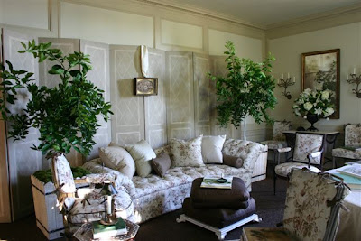
Suzanne Rheinstein's room was a soothing femme haven. What a perfect place for letter writing by a sunny window.


A spot to cozy up with a book and a cup of tea, the library of this room must be filled with great titles knowing Suzanne's penchant for good design books.


Suzanne chose stunning french planters to bring some greenery inside. This room is so light and airy with its floral fabric, dark floors and cream walls. Many of the antiques and accessories shown are available at Hollyhock


Peter Dunham did A Gentleman's Study. Dark green upholstery and boldly patterned walls with a globe pattern make this area a European-inflected retreat. His new fabrics,Globe and Almont Stripe are used along with a Syrie Maugham Armchair, After All Sofa and Caned Cocktail Table from his custom furniture collection. The items shown are through Hollywood at Home.


Waldo Fernandez did The Card Room, at the bottom of the grand staircase. What a great floor. The sheep can try and blend in, but he can't hide! A Showhouse always brings out a designer's sense of humor.


Waldo chose black painted wicker with light upholstery. Easy and casual.

Photo by Joe Schmelzer
Tim Clarke channelled old Hollywood with velvet armchairs and a sunburst on the wall in his Paneled Game Room and Prohibition Bar.

Ames Ingham created a charming The Salon de The in a little alcove off the main floor.


Ames brought in personality pieces--love the telephone table! Visit her store Ames Inghamfor more finds.


A little tea table with two small lamps that add height sparkle in the convex mirror.

Photo by Miguel Flores-Vianna
Nathan Turner's living room area had wonderful windows. Floor length panels in a cool shade of blue work with the painted ceiling.

Photo by Miguel Flores-Vianna
Nathan mixed antiques from his shop with pieces from his new Elite Leather furniture collection. The stool shown here is his design, from Elite Leather.

Photo by Miguel Flores-Vianna
Two long sofas by the fireplace create an instantly comfortable seating area for entertaining. Many of the antique pieces are available at his shop, Nathan Turner Antiques.

Photo by Doug Myers Photography
Richard Shapiro designed the Salon. Mixing antiques with his Studiolo collection, he created a space inspired by his world travels.


Photo by Doug Myers Photography
Gorgeous mill work calls for equally gorgeous art.


Photo by Tim Street-Porter
Martyn Lawrence Bullard called his room A Cabinet of Curiosity, and was inspired by global influences from ethnic patterns and rare materials. Various shades of blue ground the room. His fabrics shown here are available at Hollywood at Home.


Photo by Tim Street-Porter
Martyn used stripes and pattern to upholster furniture with great flair. the curvy arm of the settee and the lampshade bring a touch of whimsy.


Jack Fhillips took on the Great Room. Neutral upholstery plays off the stunning carpet. A young couple would surely enjoy this room. Formal but not too too. You feel you could sit on the furniture (slip covered for ease of use) and get cozy.


Photo by Don Lewis
James Lumsden, creator of Las Palmas Furniture, did this space. The cantaloupe and cream awning stripe used with touches of red gives the room a nice energy. An iron bed and drafting desk make me think a creative type would live here...


Photo by Marcia Lee
Nancy Goslee Power & Associates did the garden design for The Fountain Garden. Soothing and reserved, this is an elegant space that works well with its surroundings.

Thank you to all the designers for sending such great images. I wish I could have seen the house. There's always next year...

Thursday, November 13, 2008

FEATHER YOUR NEST FOR THANKSGIVING

Add some autumnal spark to your Turkey day table and sofa. Embroidered goodies add a special touch.


Embroidered napkins from Lady Clare add a special touch to your china and silver. Get both so the leaves can carry you through to the holidays.


Take out this leaf pillow for the season. Bring the outside in, a nature intervention, if you will. Find out where to get your embroidered beauty at Pablo Mekis

Wednesday, November 5, 2008

CELEBRATING A PASSION FOR BLUE AND WHITE BY CAROLYNE ROEHM WITH VERANDA AT JOE NYE NEW YORK

Photos Courtesy of Broadway Books/Cover photo by Sylvie Becquet

Yesterday Joe Nye and Veranda's Lisa Newsom threw a tea for Carolyne Roehm's new tome, A Passion for Blue and White. Carolyne, a Veranda Magazine contributor, was a contributor at House Beautiful when I was there. So glad she has a new book---- voracious readers are thrilled, and Carolyne's ideas are endless. In addition to seeing old friends, I got to meet fellow blogger for Mrs. Blandings, and caught up with Lisa Newsom about the Greystone Showhouse they just opened in Los Angeles. Knowing how Joe loves to throw a party and does it so well, the event was lovely and very well attended.

Carolyne shared about her love for the timeless color combination. She is a doer in every sense, after working for Oscar she started her own fashion line with a catalog. Her can do spirit has led her to do two book series, seasonal notebooks and A Passion for Flowers, Parties, At Home with Carolyne Roehm, and Presentations about gift giving. The St. Louis native relayed her first interior design experience while working as a design assistant to Oscar de la Renta. She found a fabric she loved, Brunschwig and Fil's Verriers glazed chintz, named after a well known french chateau, and wanted to use on every surface of her first apartment. As an assistant with a budget, she found a way to achieve a similar result with a different fabric. She took blue and white sheets, a licensed de la Renta design, and hung them from the walls, ruching them and covering every surface of her first New York apartment with the pattern. Being creative on a budget is not hard, and have the confidence to just try. This valuable lesson she imparted shows that you do not need to be living on a grand scale with a stellar collection of blue and white china and objects to enjoy what design and collecting offer. A chance to develop your eye and learn about the history of design can be done with a little research, and it is worth putting the time in. Just collect what you love, even if starts with some blue and white fabrics and pillows. Make it your own and find inspiration.


288 gorgeous photo-filled pages show the color combination in her interiors, flower arranging, table settings, china and linen collection and fabrics.


Collecting on this scale takes time, patience and a decorative arts fund (!). Using and enjoying what you have is paramount.


In 1994 Carolyne studied the art of floral arranging in Paris with Henri Moulie at Moulie Savart, and added to her collection of vessels in her favorite color combination. Mixing old and new pieces,in various finishes and blue tones on a table work to great effect. There she mastered the art, and began her love of all things flowers. This antique plate is so beautiful and dainty. Blue and White with a color like orange or pink layers the colors and adds a new dimension.


Many of the shots in the book were done in the studio on her Weatherstone property in Sharon, Connecticut. She cuts the blooms from her garden and brings them on set to shoot. The house is beautiful, but not devoid of heartache. In 1999, a fire burned the 1850's home to the ground. Her art, antiques and archives were lost. But as someone with nine lives does, she got busy rebuilding. Her new endeavors include a beautiful website, Carolyne Roehm,with an e-commerce portion where she sells her favorite tabletop, private label gift wrapping, decor and bridal gifts. She also creates an online magazine, CR Style, a nice way to stay informed on her latest ideas. As a Westie fan, I am so glad that she has many dogs and they are all included in her book.


The book captures moments of the color scheme, like this one with shot against a Clarence House fabric. If you are looking for great resources, check out the shopping index in the back.

Sunday, November 2, 2008

EGLOMISE MIRRORS FROM BUNGALOW 5:

My friends Luca and John of Bungalow 5 design chic and nicely priced furniture and accessories. Each season they ratchet up their impressive designs and come out with something to tempt me. Their verre eglomise mirrors are beautifully done. They chose to portray classical subjects--from ornithology to palaces and warrior figures, they work well in traditional interiors and ground modern ones. Verre eglomise, first done in 18th Century France, is painting on the back of a gilded glass panel , which in this case, has been antiqued, so it is more artwork than a mirror.
To find a retailer, contact Bungalow 5


Photos Courtesy of Bungalow 5
I am showing a series here, because they look wonderful en masse. I just can't get enough pagodas on Quadrille fabrics, painted wallpapers--I love them as a classic theme symbolizing a folly, something built to enjoy and amuse. Here, the The Autumn Pavilion


The Winter Pavilion


The Spring Pavilion


The Summer Pavilion