 Photo by Samuel Frost
Joe Lucas and Parrish Chicoat of Lucas Studio did this outdoor seating area with pops of green and brought many interior pieces out. A painting on an easel and a cabinet all weathered the elements. A lamp outside? It's California!
 Photo by Samuel Frost
In addition, Lucas Studio also created this young interior with pops of color. The walls are upholstered in a fabric from the new Ferrick Mason fabric collection. Brian Ferrick, a fabric genius, and Alex Mason, an artist, joined forces to create this terrific new line based on Alex's paintings. You can find it at Peter Dunham's Hollywood at Home in LA.
 Photo by Samuel Frost
Lucas Studio mixes great silhouette's with textured pieces. The overall effect is a great mix. Check out their shop Harbinger, which I have mentioned on earlier posts.
 Photo by Karyn Millet
Located next to the room done by Lucas Studio, Elizabeth Dinkel Design Associates were asked to create woman's guest bedroom with a Californian bungalow aesthetic. That they did, with a fresh color palette and Moroccan influences. The twin beds have wonderfully detailed valances that add a traditional element to the mid-century modern pieces. Watch this shade of green, it is a hot one!

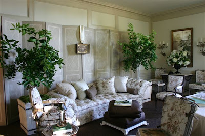
Suzanne Rheinstein's room was a soothing femme haven. What a perfect place for letter writing by a sunny window.

A spot to cozy up with a book and a cup of tea, the library of this room must be filled with great titles knowing Suzanne's penchant for good design books.

Suzanne chose stunning french planters to bring some greenery inside. This room is so light and airy with its floral fabric, dark floors and cream walls. Many of the antiques and accessories shown are available at Hollyhock

Peter Dunham did A Gentleman's Study. Dark green upholstery and boldly patterned walls with a globe pattern make this area a European-inflected retreat. His new fabrics,Globe and Almont Stripe are used along with a Syrie Maugham Armchair, After All Sofa and Caned Cocktail Table from his custom furniture collection. The items shown are through Hollywood at Home.

Waldo Fernandez did The Card Room, at the bottom of the grand staircase. What a great floor. The sheep can try and blend in, but he can't hide! A Showhouse always brings out a designer's sense of humor.

Waldo chose black painted wicker with light upholstery. Easy and casual.
 Photo by Joe Schmelzer
Tim Clarke channelled old Hollywood with velvet armchairs and a sunburst on the wall in his Paneled Game Room and Prohibition Bar.
 Ames Ingham created a charming The Salon de The in a little alcove off the main floor.
Ames brought in personality pieces--love the telephone table! Visit her store Ames Inghamfor more finds.

A little tea table with two small lamps that add height sparkle in the convex mirror.
 Photo by Miguel Flores-Vianna
Nathan Turner's living room area had wonderful windows. Floor length panels in a cool shade of blue work with the painted ceiling.
 Photo by Miguel Flores-Vianna
Nathan mixed antiques from his shop with pieces from his new Elite Leather furniture collection. The stool shown here is his design, from Elite Leather.
 Photo by Miguel Flores-Vianna
Two long sofas by the fireplace create an instantly comfortable seating area for entertaining. Many of the antique pieces are available at his shop, Nathan Turner Antiques.
 Photo by Doug Myers Photography
Richard Shapiro designed the Salon. Mixing antiques with his Studiolo collection, he created a space inspired by his world travels.
 Photo by Doug Myers Photography
Gorgeous mill work calls for equally gorgeous art.
 Photo by Tim Street-Porter
Martyn Lawrence Bullard called his room A Cabinet of Curiosity, and was inspired by global influences from ethnic patterns and rare materials. Various shades of blue ground the room. His fabrics shown here are available at Hollywood at Home.
 Photo by Tim Street-Porter
Martyn used stripes and pattern to upholster furniture with great flair. the curvy arm of the settee and the lampshade bring a touch of whimsy.

Jack Fhillips took on the Great Room. Neutral upholstery plays off the stunning carpet. A young couple would surely enjoy this room. Formal but not too too. You feel you could sit on the furniture (slip covered for ease of use) and get cozy.
 Photo by Don Lewis
James Lumsden, creator of Las Palmas Furniture, did this space. The cantaloupe and cream awning stripe used with touches of red gives the room a nice energy. An iron bed and drafting desk make me think a creative type would live here...
 Photo by Marcia Lee
Nancy Goslee Power & Associates did the garden design for The Fountain Garden. Soothing and reserved, this is an elegant space that works well with its surroundings.
Thank you to all the designers for sending such great images. I wish I could have seen the house. There's always next year...


8 comments:
beautiful images - I wish they were bigger - did you get them bigger = if so, I would love to see them like that to really study the details? can you tell which fabric Rheinstein used????? omg - I want to really see the details!!!! help me!!!!! help!!!!!! haha
I think this is overall one of the nicest designer showhouses I've seen. Not so over-the-top.
-Lana
Hi Marisa,
The Veranda Show House was incredible. You must have spent HOURS writing this piece, and downloading all these pictures. I am impressed... I heard rumor that this Veranda tour will become a regional thing. Such wonderful talent, truly inspiring!
John aka OrganizingLA
Marisa -- thank you! What a treat. Just an amazing group of talent here.
Also, I love how Peter brought back the "pickled" wood for the Syrie chairs.
Marilyn's Blue Room, absolutely love it! I also get frustrated when I can't enlarge an image and really "see" the wonderful details.
Cote de Texas, you can view larger and additional images of Elizabeth Dinkel's room, from her website portfolio located at:
http://elizabethdinkeldesign.com/portfolio/view_project/Veranda+Showcase+House
Predilection casinos? leave this advanced [url=http://www.realcazinoz.com]casino[/url] president and off with up online casino games like slots, blackjack, roulette, baccarat and more at www.realcazinoz.com .
you can also testify to our recent [url=http://freecasinogames2010.webs.com]casino[/url] mastery at http://freecasinogames2010.webs.com and increment realized fabulously misled !
another reclusive [url=http://www.ttittancasino.com]casino spiele[/url] plot is www.ttittancasino.com , as opposed to of german gamblers, sink upon erstwhile manumitted online casino bonus.
Post a Comment