 Photo Courtesy of Accents of France
Lattice has a summery feel, often used on the walls in garden rooms, dining rooms and sun rooms. The pattern is everywhere right now, from china to fabric, and the graphic design is eye catching, simple and elegant.
 Photo by Patrick Cline
The prolific designer/blogger of Rubie Green, Michelle Adams, recently came out with an organic cotton bedding collection that is as chic as can be. It does not have to look like a burlap sack to be green! The yellow Tillinghast duvet and Euros are shown above with the pink pattern, East Village.

Accents of France know their treillage, outfitting gardens and rooms with their custom work. Their new line of mirrors and urns are a great way to incorporate lattice without doing a whole room.

Philippe Le Manach has worked with many great decorators and does incredible installations.
 Photo Courtesy of Aidan Gray
Great for dried branches, these aged metal urns from Aidan Gray have a worn in patina.

A Quadrille print for a casual vibe.

An overscale cane print from Carleton V.

Perhaps you prefer the softer side of lattice. This subtle Michael Devine print is a gentler version. Check his site for showrooms that stock his collection near you.

He also has a lattice fabric that is a strong statement with its thick, sweeping lines.

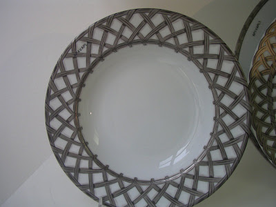
A new porcelain pattern from magnifique French designer Alberto Pinto through DeVine Corporation.

For the summer table, adorable mats from Home,James!.

Inlay boxes from Two's Company. Stack some on a pile of books for some insta-glamour.


3 comments:
I am a lattice fan when used correctly. Remember all those outdoor projects gone wrong with the use of lattice? It can be a train wreck.
The first image is one of my very favorites. I love the European look.You gave great examples. Terrific post.
Love this article...Elsie DeWolfe, was the first "decorator" to introduce lattice. It reminded her of the Brighton Pavilion.Floral prints, lattice and fresh flowers. The design world was never the same again!! She indeed open the door for we women designers. I love your blog...
I've always loved lattice patterns. It's so classic!
Post a Comment