I went to this years Design on a Dime Housing Works charity designer shopping event with a mission. My goal: to descend on Tilton Fenwick's vignette and come out with some great goods. They showed me their design scheme in advance and I was hooked. Well, I am happy to report mission accomplished. I was there when the clock struck 6pm and targeted my eyes on their wares like a laser beam.
Every booth had deals galore and many, many things I coveted. One of the best things about this event is that it is an idea incubator. Designers really have fun with their vignettes and there are many great takeaways to inspire. The rather large preview event was well produced and the evening was a must attend for the entire design community. Be sure to visit over the next few days to score unbelievable deals for charity.
 Tilton Fenwick did a booth for Traditional Home Magazine, incorporating classic Brunschwig and Fils, modern art, a Colleen and Company lantern, a Bee Line lamp and a New Traditionalists desk. Their inspiration was a design blogger.
 I wish my desk was always this neat and organized.
 This Indian chair was a steal.
 I hope someone bought their wavy mirror it was only $100.
 A beautifully styled etagere with fresh flowers and books.
 Iman and Robert Verdi showcased Iman Home showcased her ikat design.
 Charlotte Moss had fun with color.
 This hot pink wall with salon style hung artwork is amazing.
 Malcolm James Kutner had beautiful finds. Miles Redd swooped in to buy the sofa.
 The antiques were great.
 A painted canvas rug is an easy way to add pattern to a room.
 Miles Redd created a killer space with red, yellow and blue.
 Genius!
 It was hard not to buy it all.
 Elaine Griffin created a pink and a green room with Home Goods.
 She is great with accessorizing a space- you just want it all! Until you realize you may need a truck to get it home.
 To think all these things can be found at Home Goods makes me want to peruse their stores more often!
 Check out that wild butterfly bench.
 Larry Rulh for High Falls Mercantile.
 This was like visiting a great antiques shop.
 Arlene Angard created a summery spot.
 What a fun table.
 Bradley Stephens created a tenement apartment.
 That small sofa was tempting.
 Bradley Thiergartner had some major pieces and a great installation.
 Ernie de la Torre had a Karl Springer table as a centerpiece.
 Carrier and Company had walls filled with pop art.
 Someone could create an entire design library with the books from all the booths.
 Daniel M. Pafford's blue and white bedroom.
 No detail was overlooked.
 Foley and Cox created a serene pale bedroom.
 Spa at home.
 They had many things from Aero that were deals.
 Giovanni Naso had nice pieces.
 Katie Ridder incorporated her fabrics on a beautifully shaped sofa. Pops of red made the space very Katie.
 This chair was another hard to resist piece.
 Form Architecture and Interiors had great lighting and an irrestistable dog portrait.
 Elizabeth Bauer's booth was a festival of color.
 Bright Kim Seybert goodies make summer entertaining a breeze.
 Lara Spencer mixed fun artwork and vintage finds.
 Katie Lydon added geometric pattern to neutral pieces.
 Lillian August sold most of their things. I coveted the rug.
 NYSID grouped together many designers in a collective space.
 Patrick James Hamilton created a glamorous space.
 Icy blue and white glassware on a sideboard.
 Ralph Lauren Home looked crisp in blue and white.
 Crisp and summery stripes were everywhere.
 Jack Bergamino for Paul Smith went for touches of neon and the signature haberdashery stripe.
 It was like walking into a Paul Smith store the portraits made it so fun.
 Robert Passal had a horse mural painted on site that is also for sale.
 He had great lighting and a large round mirror that got scooped up.
 B. Russell Groves made black and white sophisticated and inviting.
 Steven Sclaroff always has incredible things for amazing prices.
 Shawn Henderson paired pieces with clean lines and greys.
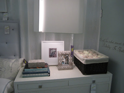
 Tricia Foley and Roy Hardin for The New General Store had a clean and modern space-- their signature look is warm and zen.
 Their tabletop included Donna Karan Home for Lenox and a Thomas O'Brien pendant light hangs above.
 Asler Valero built out a kitchen with silvered walls.
 Booths throughout were painted with Valspar colors. They painted pieces of furniture in tempting brights.
Every booth had deals galore and many, many things I coveted. One of the best things about this event is that it is an idea incubator. Designers really have fun with their vignettes and there are many great takeaways to inspire. The rather large preview event was well produced and the evening was a must attend for the entire design community. Be sure to visit over the next few days to score unbelievable deals for charity.
 Tilton Fenwick did a booth for Traditional Home Magazine, incorporating classic Brunschwig and Fils, modern art, a Colleen and Company lantern, a Bee Line lamp and a New Traditionalists desk. Their inspiration was a design blogger.
 I wish my desk was always this neat and organized.
 This Indian chair was a steal.
 I hope someone bought their wavy mirror it was only $100.
 A beautifully styled etagere with fresh flowers and books.
 Iman and Robert Verdi showcased Iman Home showcased her ikat design.
 Charlotte Moss had fun with color.
 This hot pink wall with salon style hung artwork is amazing.
 Malcolm James Kutner had beautiful finds. Miles Redd swooped in to buy the sofa.
 The antiques were great.
 A painted canvas rug is an easy way to add pattern to a room.
 Miles Redd created a killer space with red, yellow and blue.
 Genius!
 It was hard not to buy it all.
 Elaine Griffin created a pink and a green room with Home Goods.
 She is great with accessorizing a space- you just want it all! Until you realize you may need a truck to get it home.
 To think all these things can be found at Home Goods makes me want to peruse their stores more often!
 Check out that wild butterfly bench.
 Larry Rulh for High Falls Mercantile.
 This was like visiting a great antiques shop.
 Arlene Angard created a summery spot.
 What a fun table.
 Bradley Stephens created a tenement apartment.
 That small sofa was tempting.
 Bradley Thiergartner had some major pieces and a great installation.
 Ernie de la Torre had a Karl Springer table as a centerpiece.
 Carrier and Company had walls filled with pop art.
 Someone could create an entire design library with the books from all the booths.
 Daniel M. Pafford's blue and white bedroom.
 No detail was overlooked.
 Foley and Cox created a serene pale bedroom.
 Spa at home.
 They had many things from Aero that were deals.
 Giovanni Naso had nice pieces.
 Katie Ridder incorporated her fabrics on a beautifully shaped sofa. Pops of red made the space very Katie.
 This chair was another hard to resist piece.
 Form Architecture and Interiors had great lighting and an irrestistable dog portrait.
 Elizabeth Bauer's booth was a festival of color.
 Bright Kim Seybert goodies make summer entertaining a breeze.
 Lara Spencer mixed fun artwork and vintage finds.
 Katie Lydon added geometric pattern to neutral pieces.
 Lillian August sold most of their things. I coveted the rug.
 NYSID grouped together many designers in a collective space.
 Patrick James Hamilton created a glamorous space.
 Icy blue and white glassware on a sideboard.
 Ralph Lauren Home looked crisp in blue and white.
 Crisp and summery stripes were everywhere.
 Jack Bergamino for Paul Smith went for touches of neon and the signature haberdashery stripe.
 It was like walking into a Paul Smith store the portraits made it so fun.
 Robert Passal had a horse mural painted on site that is also for sale.
 He had great lighting and a large round mirror that got scooped up.
 B. Russell Groves made black and white sophisticated and inviting.
 Steven Sclaroff always has incredible things for amazing prices.
 Shawn Henderson paired pieces with clean lines and greys.
 Tricia Foley and Roy Hardin for The New General Store had a clean and modern space-- their signature look is warm and zen.
 Their tabletop included Donna Karan Home for Lenox and a Thomas O'Brien pendant light hangs above.
 Asler Valero built out a kitchen with silvered walls.
 Booths throughout were painted with Valspar colors. They painted pieces of furniture in tempting brights.


6 comments:
Love the post and all your amazing pics! Hope you are enjoying your new IPad! xo
I loved the pictures! The furniture were amazing, beautiful tables, chairs and the colors were lovely|! cool post, check out also 3D Rendering
GReat shots and coverage!! I just loved Tilton and Fenwick's booth as well. But you didn't tell us what YOU bought!!
Thank you, thank you, for taking me along on this decorating trip. Loved seeing all your pictures. xxpeggybraswelldesign.com
There were so many booths I could not show all of them-- so much to see and buy!
Thank you for the great coverage and including my room!!! It was an honor to be included for this wonderful cause.
Arlene Angard
Post a Comment