With no need to nickel and dime prices, Design on a Dime's deals were stellar again this year. Designers agree it is the most fun design shopping event of the year, where you see old friends and meet new one's all in the name of charity. Sharing a love of great design along with deals, Metropolitan Pavillion was packed for DOAD's opening night. As the buzzer went off at 6:30 pm, people scooped up the great goods with fervor to benefit Housing Works.
My big score was something I've wanted for ages, a fantastic Christopher Spitzmiller lamp. I pounced on it in Nick Olsen's vignette, but had to limit myself for practicality. Let's just say it made me oh-so happy. The thing I love most about vignettes is the immense creativity they bring out. The ephemeral nature of them means sadly, nothing this good lasts forever. I took well over 100 photos, and here are some standouts from the evening.
Lara Spencer for One King's Lane included pretty artwork and easy to live with upholstered pieces.
Speaking of pretty, anemones and peony's in oranges and pinks made their booth springy.
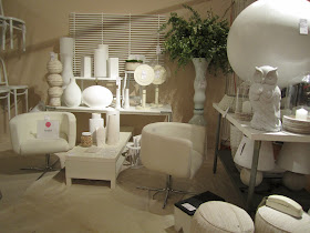
Ford Huniford, the founding chair, created a monochromatic montage. Mixing found objects with painting things in snow white, the impact was amazing.
Evette Rios for HomeGoods had a great curved high back sofa, flower ottoman and chairs covered in Dwell fabric. Her vignette was in honor of Will and Kate, if they had a NYC pad.
Combining horse show ribbons and rustic chandeliers, Dering Hall's booth had a festive feel with chic furniture.
Mixing brightly striped rugs, an ikat spotted umbrella, masses of flowers and a trad chintz and blue and white plates on the wall, newcomer C. Wonder wowed.
Tons of blue and white china at cheap and cheerful prices went quickly.
The large space was a harbinger of spring. The umbrella was not for sale but I sure wish it was.
Eddie Lee put a framed fabric of succulents on the wall to kick off the garden theme. With light wood accessories, beautiful potted boxwood and amazing upholstery there were good finds here!
In Arden Stephenson's booth, black and white floral backed the main wall and happy turquoise Valspar paint made the chic sitting room complete. I wonder who walked away with the Flokati stool, what fun.
Minimalist chic in Brad Ford's booth was highlighted by an amazing photo series of a woman walking briskly against a red background. The energy of the piece was riveting. As always, Brad's ability to make greenery look sculptural was evident.
A red Bungalow 5 linen wrapped console and cubes with nailhead trim would surely make anyone happy.
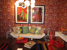
Pappas Miron Design used a killer Alpha Workshops wallpaper with their upholstery laden den.
With the scale of everything suitable for urban dwelling, I wanted Nick Olsen's entire booth transported to my apartment stat.
This diminutive French chair in purple wool was chic chic.
My score: a Gregory Lamp from Christopher Spitzmiller in the most amazing pale green.
The ever-creative Harry Heissmann painted his walls purple and filled is space with quirky fabulous stuff. A pair of Spitzy lamps were still there!
A loden green mohair sofa with a high arm is a lifetime piece for sure.
I really wish I had the time to pick some artwork from Pocker, it was framed and ready to roll.
Lifestyling by Maria Gabriella Brito was retro chic.
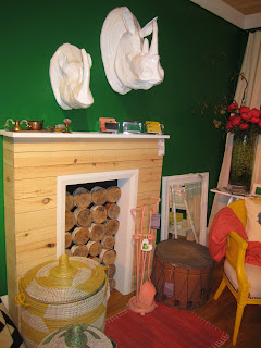
Hats off to the Housing Works crew for creating the coolest booth with flour accents.
They had a trove of John Derian paperweights to rival his store, and worked with Housing Works donations.
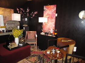
Patrick James Hamilton Designs scheme was dark and broody with great accessories. Notice that Baker lamp?
Rick colors tied the scheme together in a way that showed it took ages to orchestrate.
Katie Lydon had varied pillows and cool interesting pieces.
Aurelien Gallet has a knack for unique accessories from a variety of historical periods.
Cullman and Kravis's pink cocoon with boxes of candy stacked on the floor.
Just like his refined work, Matthew Patrick Smyth's booth was a snapshot of his interiors. Pale hues and comfortable pieces with symmetrical bookshelves.
That zebra rug! Neal Beckstedt had lots of usable pieces.
Along with great artwork.
Wiley design had black and white popped with pink for great impact.
Ideas aplenty here.
The guys from Flair brought their A game with serious Italian vintage.
Killer artwork too.
Jim Fairfax used a pale pink wall and earthy colors.
Many of his pieces were custom.
The 70's vibe of Nathan Thomas Studios chocolate brown space was comfortingly transporting.
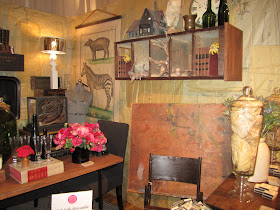
I was looking forward to the High Falls Mercantile booth, as I knew it would be chock-a-block again this year.
Old good things...
Another 70's interior from Buzz Kelly was totally amazing. A painted wall with pastel colored rays was next to a wall with a bulls eye painting of the same colors. So creative.
A pomegranate colored sofa I believe a Vladimir Kagan piece, balanced the color variety.
One more angle.
Juniper Tedhams minimal, artistic space with crystal chandeliers and antique beds was statement making.
David Duncan Antiques had a fanciful painted backdrop with flowers and beautiful greenery.
Studio Printworks cone shaped black and white geo pattern provided the backdrop for Miles Redd's op art cocoon. Of course, everyone was awed by it.
Let's just say things went like hotcakes.
Foley and Cox had a large space to create a long living room.
Touches of Americana made it a cozy enclave.
There were so many nice pairs of candlestick lamps and lighting in general throughout the vignettes.
An antique mantel and comfortable reading chairs.
Country casual.
Lipstick red walls set the stage for the red, black and white world of Alessandra Branca.
She mixed beachy seagrass cubes and good antique pieces with strong lines.
I coveted this quilted slipper chair.
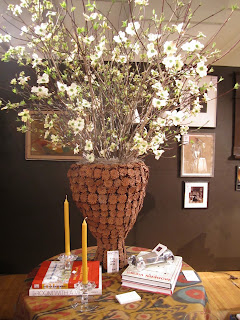
Genius Mark Cunningham's montage of natural materials with pops of white was spellbinding.
A great merchandiser, accessories were grouped in clusters by varying heights.
Texture and form come together so beautifully, Mark, when will you open a retail store?
Ernest De LA Torre paired blue walls, red lampshades and yellow National Geographic issues for a pop of primary colors.
Recreating her daughter's bedroom, Tilton Fenwick covered walls in an ethnic - inspired teardrop wallpaper in a bright green. Clarence House fabric accents on a canopy bed tied it all together.
The New Traditionalists dresser trimmed in green was stocked with classic children's books. Pops of vivid color made the space fun and dynamic.
My friend Mimi scored the bed for her daughter, yay!
With an eye for the best, Kristen McGinnis paired African accents with a neutral palette.
A zebra lamp, klismos chiar and mid-century desk.
Amazingly, the first edition Marc Newsom chair was still available by night's end.
Lilian August had an aviary as a centerpiece for ethnic finds.
Pops of yellow and kelly green with black and white made Genevieve Gorder's booth of re-finished Housing Works finds fresh.
Never one to shy away from color, Amanda Nisbet was up to her usual fun fabulous tricks. The neon sign says it all.
I wanted this custom sofa! It is the perfect scale for apartment living. Not sure the print was for me though.
A chartreuse lacquer desk sat beside a giant wooden turtle. Barbie dolls were hanging out too. And what's that I see? Yes, another great Spitzmiller lamp! I tipped a friend off and she nabbed it.














Thanks Marisa for this wonderful and very complete post - I'm thrilled you included me! Much love, Harry
ReplyDeleteSO many beautiful designs! Thanks for sharing
ReplyDeleteMy favorite space is the monochromatic one! I love designing that way...if you have a color you love, why not do it all over?!
ReplyDeleteI love Kristen McGinnis' African accents.
ReplyDeleteThese interior designs are just amazing. This is great useful blog for selecting the best interior for the home decoration. I think your blog will give those people a good reminding those who wants to get interior design their home And they will express thanks to you later. Thanks for the information. Keep sharing with us.
ReplyDeleteinterior design
OMG! I feel like i was there! your post is so comprehensive and now it's clear what all of the excitement is about.
ReplyDeleteGreat to meet you in HP.