So how do you make a modern glass box livable? That was the question many designers asked themselves as they prepared their rooms for this year's Kips Bay Showhouse. Situated in a tower in the sky with river views, two duplex apartments received the designer treatment. With nary a piece of molding in sight, the design challenge began. The chosen participants spun their web of transformation in a jiffy. Since these are professionals, they rose to the occasion with brilliance, creating unique spaces with something for everyone. I will delve into the design standouts over the next week, so visit the far Westside and take a look. If traveling cross town is too much to process, Kips Bay has organized a shuttle bus that leaves from the Park Avenue Armory at 66th Street.
Speaking of brilliance, the brilliant color green was big this year. It was present in every hue, from jade to grass, the verdant color vied for attention. From Charlotte Moss covering an entire room in floor to ceiling pea green velvet (masking the soffit overhang like the lining of a jewelry box) to Jamie Drake painting his walls a matte teal finish, the veteran designers used the color to great dramatic effect.
Todd Romano's dining room with double height ceilings and soaring windows. French Directiore chairs upholstered in Brunschwig and Fils grass green silk matched the Dodie Thayer pottery he set on the table.
A massive pineapple welcomed us. Designed by Horacio Madrigal Terra Cotta, it is from Claremont, in case you were wondering. The color matched the aubergine walls.
To say I have a fondness for Thayer Lettuceware is an understatement. I adore it. You can always count on Romano for Porthault linens and gorgeous china.
Charmer alert! A miniature vase of carnations at every place setting provided a warm gesture of hospitality.
What Kips Bay room would be complete without a handmade lamp by Christopher Spitzmiller?
Bringing the natural world inside, Charlotte Moss's room appealed to all the senses. She covered a wall in boxwood, the facing wall had blown up images of manicured French gardens, and swathed everything in varying shades of green. The darling round-backed Charleston Slipper Chair and white cut corner table are two pieces from her new Century Icon's Furniture collection. The scale and amount of detail on them are just perfect, and I think my apartment would agree. The Natchez Camel Back Sofa has Fortuny Pillows from David Duncan on it to add a little shimmer. To further enhance the greenery all around, the sounds of chirping birds created a transporting experience.

Bringing the natural world inside, Charlotte Moss's room appealed to all the senses. She covered a wall in boxwood, the facing wall had blown up images of manicured French gardens, and swathed everything in varying shades of green. The darling round-backed Charleston Slipper Chair and white cut corner table are two pieces from her new Century Icon's Furniture collection. The scale and amount of detail on them are just perfect, and I think my apartment would agree. The Natchez Camel Back Sofa has Fortuny Pillows from David Duncan on it to add a little shimmer. To further enhance the greenery all around, the sounds of chirping birds created a transporting experience.

Photos by Eric Striffler
Working with her new Fabricut collection, she covered the room in velvet and upholstered pieces in her green florals and prints. Getting creative with the wall space, she hung antique engravings at eye level and placed a Vladimir Kanevsky Porcelain Hollyhock on a gilded decorative bracket.
Catching everything in its reflective glow, the walls of Thom Filicia's lacquer box.
His Vanguard Copake Eagle Console held sway on one wall.
On another wall, his cool modern Abstract Lines artwork from Soicher Marin were hung above a bench he designed for Vanguard.
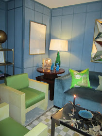
Brian del Toro is a name you may not know but you should. He is enormously talented, having worked for some of the best in the business. He was a senior designer when I was at David Kleinberg's office. His has impeccable taste. Spring green cushions in F. Schumacher's Prestwick wool sateen in shamrock on parchment club chairs from the 1960's mirror the clean lines in the wall treatment.
To counter the pop of green, French blue walls were treated with linear paneling. There were many great takes on how to treat walls this showhouse.
A rarified old world vintage Longchamp desk set and lamp tied the shades of green together. How civilized. Desk sets are making a comeback. I think the luddite in everyone is emerging to counter our obsessive ipad use.
What can I say? Jamie Drake just knows how to style a bookcase. He too used interesting horizontal panel detailing in more of a forest green/teal combination.
Beautiful porcelain flowers nestled amongst the books.
Scott Sanders created The Cabana, a room that is ready for summer. Incorporating a classic Scalamandre resist print recolored in a green, blue and yellow floral pattern.
Meshing mid century modern and the way we live today, Sanders artfully crafted a fun hang out space.
Phillip Jeffries Juicy Jute grasscloth in split pea added requisite zing on the walls teeing up the pair of fluoro Warhol pop art cows.


No comments:
Post a Comment