Using the surface areas of tables and shelves to achieve both creative and beautiful results, interior designers at this year's Kips Bay Showhouse showed their creative mettle with how they style surfaces. Taking a plain, unadulterated blank canvas and adding decorative objects, lighting, books, barware and personal objects to it to create a beautiful statement is not easy. Art directing their surfaces, and probably re-working them several times to get it just right, this arranging knack is an art form. Below, take a look at how these designers go from nothing to creating quiet something. I have just scratched the surface... The KB showhouse is open until June 14th, so make your way to the West Side to see it soon!
Todd Romano paired white Christopher Spitzmiller lamps with bright green porcelain for a pop of color against the black marble surface.
Brian J. McCarthy, Bunny Williams and David Kleinberg added antique objects with a spare spatial direction on the coffee table and side tables in their living room space.
A bar on a chest, in the designer trio room with Venetian glassware and party basics.
Jamie Drake had a large bookcase in his library with books and 1930's flower ceramics in his library.
David Scott created a bar shelf on the sculpted bronze Paul Evans etagere in his gentleman's study, amidst stacks of boxes and smaller sculptures.
There is something really cool and new agey that the illuminated obelisk sculpture adds to the art filled shelves.
Spare and clean, each desk accessory stands on it's own because of it's unique material and shape.
A minimalist console from Maison Gerard outside Raji Radhakrishnan's room holds tea service. The juxtaposition of the console and bright Larry Zox painting from the 1970's is great. The clean shapes tell the story.
A low Laverne bar cabinet is a charming scale, the perfect surface to add a bar, light source and vase of flowers. I was totally smitten with the fruit - shaped glass decanter on a petal shaped tray.
Her private office was that of an art curator, in the midst of doing extensive research.
How cool is this skewed Sebastian Ezzaruiz Tilt Bookcase?
In Brian Del Toro's study, a German 1930's Art Deco table from HM Luther holds a rare few accessories to showcase the decorative surface.
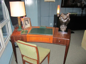
The subtle curve and small scale of the Jacques Adnet Rosewood Desk fits so well in this spot by the window. Fitted with a 1950's Longchamp Desk set it is more a place for light work.
Brass etageres hold small, tight stacks of books and spare decorative trays, boxes and artwork.
Her love of the Grand Tour plays in Alexa Hampton's bedroom tablescape.
A nightstand holds the prerequisites for a relaxing bedroom. Fresh flowers, good lighting, pretty framed paintings, and decorative objects.
By using the wall-of-windows as a backdrop, Neal Beckstedt propped up a painting behind a wood table.
To create visual interest above eye level, he added decorative objects and storage on top of a 1940's armoire from Bermingham and Co.
A woven light wood Edward Wormley Credenza from Wyeth holds a perfectly styled summer bar and an alabaster lamp from Lorin Marsh in Scott Sanders super summery cabana.
By upholstering the walls in his lounge, Shawn Henderson created an enveloping space. Adding a long shelf along the wall allowed for a functional storage area. Capped on each end by a pair of 1950's leather lamps from Tom Thomas, the shelf holds books, magazines, candlesticks and artwork.
Using artwork as his muse, Alexandra Doherty placed framed artwork strategically around a collector's bedroom. A red Robsjohn Gibbons commode holds oak forms on stands, a contemporary cast plaster Etruscan lamp from Jonathan Burden and a few books.
A 1940's desk with a stingray top an Asprey blotter and has two light sources, a brass lamp and elaborate candelabra.
A Mexican chest of drawers from Downtown at Claremont performs double duty, holding family pictures, a lamp for great illumination and a bar tray in Susan Zises Green's living room inspired by the Hudson River views.
Never underestimate the power of fresh elements! A scallop-edged bowl holds clementines, while fresh purple anemone's balance out the bright color next to them.
Custom shelves in Patrik Lonn's room for supper hold tonal ceramics and Swedish crystal from Free Forms USA. There is a real serenity accomplished here, in such a small area.
Decorative painter Chuck Fisher created the view, painting his writing room with a New York scenic landscape. Furniture was placed sparingly, making the enveloping landscape really stand out.
The desk, created by Alpha Workshops at Profiles holds a desk blotter, and it's owner is in the midst of writing thank you notes.
Thom Filicia's Copake Console holds beautiful peonies, several books and two Burmese ebony objects.


Its the details of our lives I think that in some respects make the impact. Its only once in a while the big picture matters. I loves these photos of the details.
ReplyDeleteMarisa very inspiring vignettes. I will be pinning several!
ReplyDeletexoxo
Karena
Art by Karena
Gorgeous post. Love the details.
ReplyDelete