Photos courtesy of J + G Design
Jennifer Beek and Georgie Hambright
Although though they were both students at University of Texas in Austin and even lived on the same street while there, Jennifer Beek and Georgie Hambright met years later in New York. They reconnected two years ago at Design on a Dime, the must-attend New York design event, and realized they they loved the same things. At the time, they were both doing design work -- Jennifer interned for the late great Albert Hadley, and Georgie worked for Bunny Williams among others-- but decided to start a business together when the timing was right. Goergie entered design from the PR world, and I met Jennifer Beek when she was working for Albert Hadley alum Harry Heissmann. I see the design duo, called J +G Design, at many a design event, being part of the community dialog and interfacing with new products at launches and parties. Being out and about has certainly benefited them, helping to create an awareness in their target market. Attracting a young clientele, often those decorating their first apartment, they push out creative inspiration on their blog Curatorial and instagram, updating their trad with a twist following on what they are seeing and doing. I was eager to get the lowdown from them on practical advice they had for other designers eager to hang out their shingle and hear what is inspiring them now. They have captured the attention of design watchers with their appreciation of design classics, and have recently been asked to overhaul the Avery Boardman Showroom at the D and D Building. Read on for more on J+ G Design and find them on Instagram @jandgdesign
Who did
you work for and where did you study to learn the trade?
Jennifer:
I studied architecture at the University of Texas, Austin. For my last
two summers in college I was lucky enough to intern for the late Albert Hadley,
where I met and became very close to senior designer, Harry Heissmann. Upon
graduating from UT, Mr. Hadley encouraged me to pursue a Masters in the
Decorative Arts and suggested I look into the Sotheby's Masters in Fine and
Decorative Arts program. In the summer of 2009, between undergrad and
grad school, I helped Harry launch his own design firm, Harry Heissmann, Inc., where
I would intern throughout grad school and then work upon graduation until March
2013.
Georgie: I studied at Parsons and
worked for various designers in Manhattan, Kemble Interiors, Bunny Williams
Inc., and Blair Harris Interior Design, in that order. I strongly suggest
working for different designers to help evolve your own personal style and to
learn as much as possible about how they run their business.
When
did you know this was your calling in life?
J: I
would have to say at age 4, when I decided to "wallpaper" my parents'
bedroom with neon construction paper and glue. It was more of a wainscoting
as that is about as high as I could reach! But in all seriousness, I
thought I wanted to go into fashion design because I was drawn to textiles. Soon
after I discovered I loved arranging spaces and realized that interiors was
where I wanted to be!
G: I think I always knew
that it was what I wanted to do, but was too afraid to admit it. Once I decided
to pursue design, enrolled in Parsons and was surrounded by like minded people,
I knew I was where I was supposed to be.
How did
you know you were ready to strike out on your own, and when did you?
I don't
think you ever really know if you're ready to go out on your own. Working in small offices
enabled us to see the day-to-day things that need to be done - learning how to
actually manage your business is crucial. We clicked right from our first
meeting--having the right chemistry and working relationship is
everything! We had a few side projects we had developed together, which
is ultimately what gave us the confidence to strike out on our own. We
knew that if we didn't do it, it would always be a side project, thus J+G
opened its doors officially in March 2013.
What
advice do you have for others wanting to do the same?
Think
it through. We didn't just quit our jobs one day and decide to open shop.
It was a year in the making--developing a mission, a business plan,
company goals, establishing a brand, etc. It is a big undertaking, but we
are lucky to have one another!
Do you
have a design mentor?
We are
constantly reaching out to other designers to meet with us for coffee! It
can be isolating going off on your own, so we love to get together with other
people in the industry to pick their brains! Obviously we look up to the
designers we worked for in the past--they taught us everything we know!
What
did they teach you that you can't learn in design school?
Trust
your eye. This is something that takes time to develop, but we try to get
out of the office as much as possible to visit new workrooms and go to exhibits
and galleries. It is really about constantly educating ourselves.
What is
the most practical knowledge you learned from working for a master
designer?
Hands
down, proportion and scale. You must understand those in order to have a
successful project.
Do you
have a signature look and how would you define it?
We
would describe our aesthetic as traditional design as we see it through our
lens - equal parts eclectic and tailored, glamorous and relaxed, bold
colors/pattern and subtle textures. It's this unique balance that we strive for
in every space.
What is
the biggest challenge of being your own boss? Has that evolved from when you
began?
The
responsibility of running a successful business was daunting. We are the
last line of defense so it's all on us! Our confidence has definitely
grown over the past year and we have learned how to deal with various
situations.
You are very social
media savvy, how has that engagement helped you?
We knew from the start that this was going to be huge for us as a young business. Starting
out you don't have photographed projects, so it is the best way to convey our
taste and aesthetic to the design community and potential clients. Our favorite
platform would have to be Instagram.
How do
your clients find you?
All sorts of ways, social
media and press being one of them, but word-of-mouth is still the most
prominent way.
Whose
work of the past do you hold in high regard?
Albert
Hadley--it is actually our connection to one another...both Harry and Bunny
hailed from him!
What
books do you own old and new that you constantly refer to?
Parish-Hadley:
Sixty Years of American Design
Billy
Baldwin Decorates: A book of practical decorating ideas
Mario
Buatta: Fifty Years of American Interior Decoration
Thomas
Pheasant: Simply Serene
Where
is your inspiration coming from right now?
We are
so lucky to live in NYC! We are constantly taking photos of inspiration,
whether it be a new restaurant, boutique, workroom, etc. Most recently we
were so inspired by all the amazing work coming out of The Alpha Workshops. If
you can dream it, they can make it.
What do
you think is next regarding trends in color, material and style?
While
we don't typically adhere to trends, we are seeing a lot of the monochromatic
look--very tone on tone, but with more attention to a variety of textures.
Do you
have a favorite fabric pattern or print you return to?
Yes--
Kelly Wearstler for Lee Jofa, Confetti in black/ivory. It's fun, yet tailored
and makes everything look fresh. We recovered the seats of a set of antique
dining chairs and the client's loved them. When in doubt, confetti it!
What
material do you love?
Nothing beats soft
buttery texture of velvet. The color options and textures are endless. It can
be dressed up or dressed down - you just can't go wrong!
Where
do you like to shop?
Perusing
Pinterest or 1stDibs is the most convenient way to get inspired, but we are
both very visually minded people. We love John Rosselli and Flair--they do a
great job of styling.
What
stores and or resources do you shop in the most?
We
love helping clients achieve a high-end look within their budget, this means
using a high/low mix of pieces. We shop across the board, everything from 1st
dibs to vintage/consignment stores. We try not to shop at the same places all
the time. We're always looking for new artists and resources.
Where
are you eager to do a project?
Right
now, specifically? Anywhere warm! We cannot wait for Spring to arrive!

Furniture with classic silhouettes in a New York living room. Ever mindful of key to comfortable seating arrangements, they have a spot to place a drink beside each seat.

The color-accented mix of furniture styles and a touch of pattern to offset the neutral white walls.

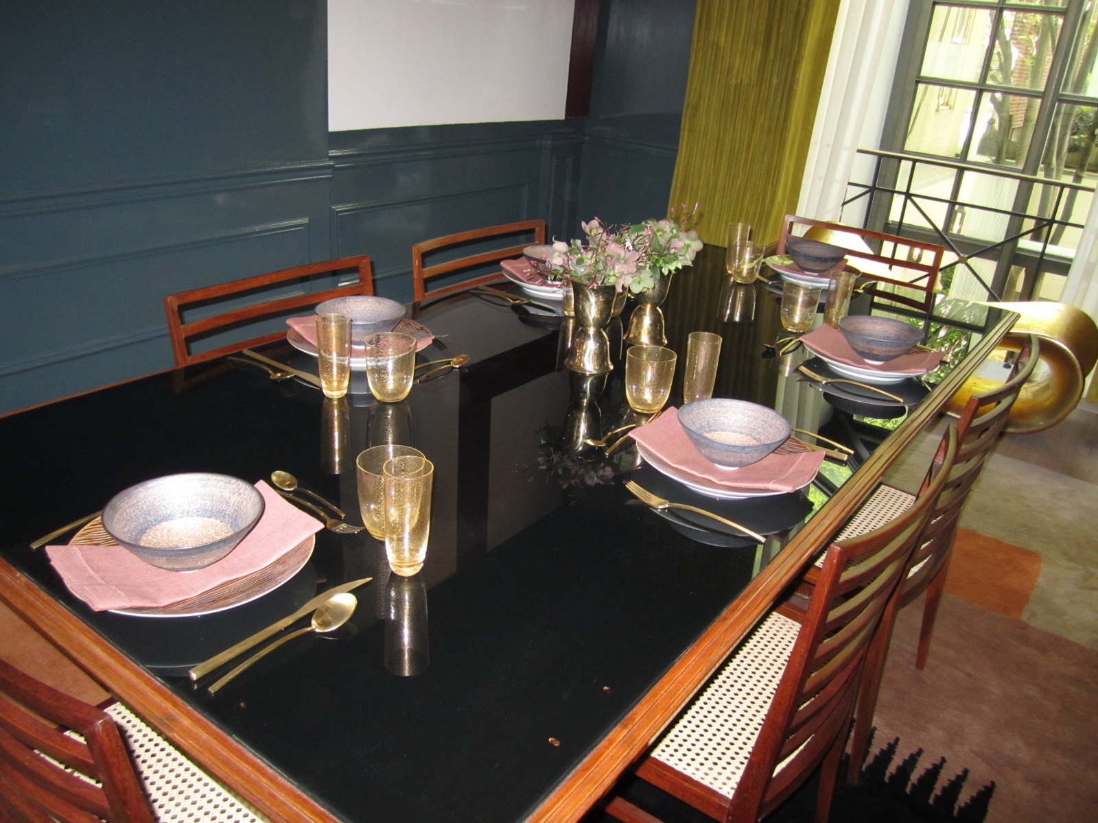
The dining room, with Biedermeier chairs and a mid century chandelier. Red vases make a nice centerpiece addition to the dining table when it is not in use.

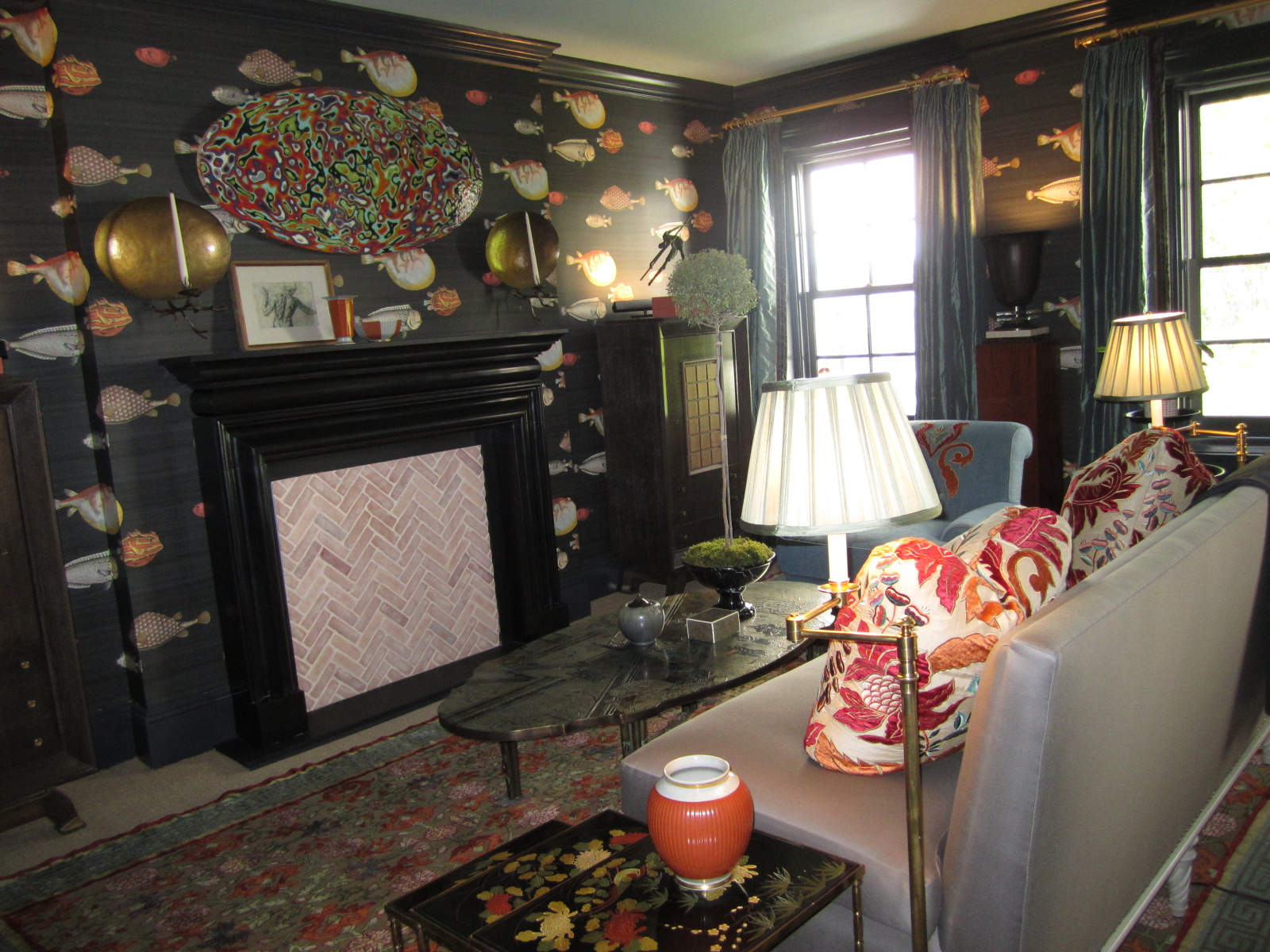
A red and blue abstract portrait hangs above a console-as-bar.

An interesting gallery art wall anchors the living room in Jennifer's apartment.

A dash of red, black and white pattern and brass make a handsome traditional nailhead-trimmed headboard come to life.

An antique dresser dressed up with a mustard yellow lamp and sunny vintage print.

A colorful tablesetting for a birthday fete features a coral and melon Quadrille print and accents of blue.

Their Avery Boardman scheme includes handmade Christopher Spitzmiller lamps and fresh printed fabrics.

A corner desk with instant library for a client.